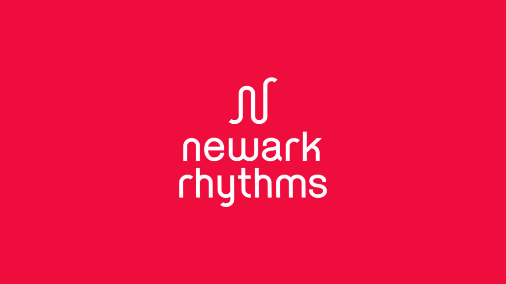

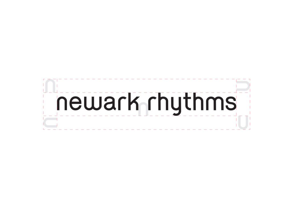
The Newark Rhythms wordmark is customized following the curvature and spacing provided by the mirroring lower case “n” & “r.” It creates a gestalt through the repetition of the letter’s formal qualities establishing rhythm through typographic flow.
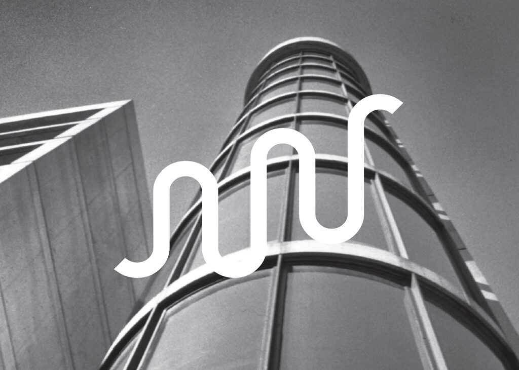
The icon’s single line creates wave gestures granting flexibility to the entire brand. Supporting visual elements derived from the icon’s permutations keeps the identity continuously evolving.

A historic photographic collection of the Rutgers University-Newark campus’ life and architecture, appear on stationery & promotional materials.